Conceptualizing and designing the FC Barcelona
Back in Stock app.

FC Barcelona
Role Year
Qualitative Research 2025
Conceptualization
Product Designer
Introduction
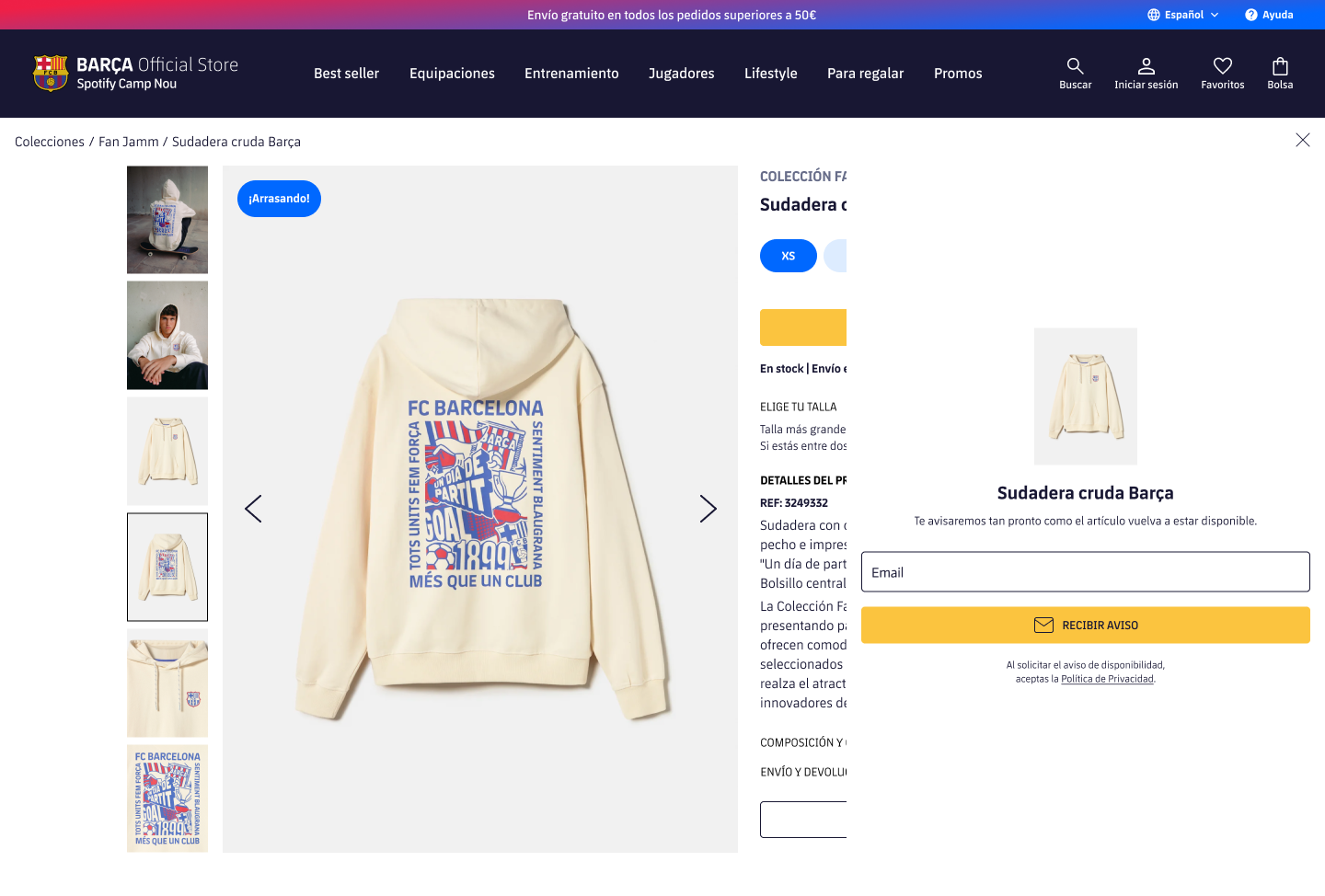
FC Barcelona store is one of the futbol clubs with more online sellings all over the world, and consequently they deal every month with a lot of product returns and size changes.
Objective
Making the management of all this operations easier for the ecommerce internal team. Sincronizing all the signups and notifications from the same shopify app platform, showing specific useful data information, and making it fast for them to manage some specific functions.
Main challenge
The real challenge of this project wasn’t just designing a functional tool, but transforming complex and scattered data into a clear, accurate, and most importantly strategic experience.
It was about revealing, almost in real time, which products and variants were generating the most interest among thousands of users, enabling the team to act quickly and precisely. But there was more: the system had to be smart enough to control notification sending based on customizable rules, avoiding user fatigue and making the most of every conversion opportunity.
And as if that wasn’t enough, the challenge also involved aligning the needs of different departments within Barça’s internal team, each with its own goals and priorities. Success didn’t just rely on design or technology, it depended on making everyone speak the same language through a tool that was simple, powerful, and strategically fine tuned.
Our workflow
Kickoff + Briefing
We collected information about the client needs, interests and frustrations with it’s current app for managing the back in stock clients notifications. As all the possible scenarios they could find themselves at, to prevent and cover all their needs.
Benchmarck
We conducted a comprehensive analysis of other apps to understand how they solved similar problems and find out which other features were covered by the app.
Conceptualization
– Ideation
– Wireframing
– Prototyping
– User testing
– Iteration
Data Analyst wants to see specific data
The fact of building an app from scratch with tailored functionalities allowed different departments of the client’s team to address their needs. From the team responsible for ordering new stock, to data analysts, to those in charge of ecommerce.
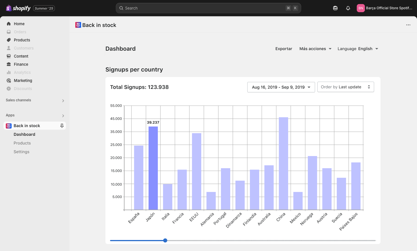
For example, the Data Analysis team was interested in quickly and easily viewing data such as the total number of signups per country or which products are in highest demand.
Signups per Country
The client needed to visually and quickly understand which countries the registrations were coming from, with the ability to filter by time. Since some products are launched in one country before others, this could help organize future launches.
Understanding the exact metrics (e.g., total signups, registrations per product variant, or demand trends) was crucial to avoid overloading the chart with irrelevant data, ensuring it remained clear and actionable. The client emphasized quick and easy interpretation, so prioritizing key metrics like registrations by country and time was essential.
Since the client wanted to evaluate product launches, which might occur at different times across countries, flexible time filters (e.g., custom date ranges or predefined intervals like monthly/quarterly) were necessary to analyze launch performance and product overlap effectively.
Most Wanted Products
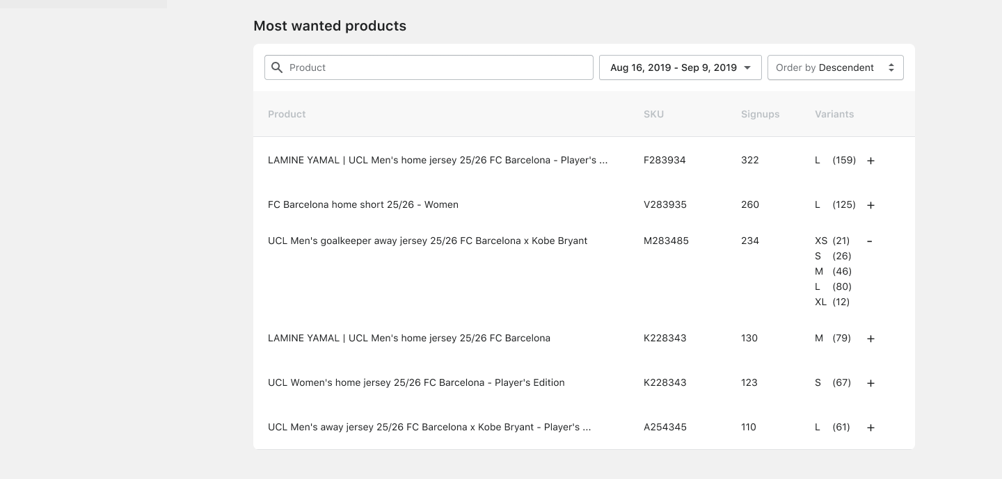
The client needed to quickly see which products were in highest demand.
At first, a bar chart seemed like an interesting solution for this case, as it needed to show the products with the most registrations and the number of registrations each of them had.
But as we worked on it and understood the client’s needs, we realized that the data was not very relevant, as each product has size variants, and what a customer registers for is not the product notification, but a specific variant of that product. This insight made us realize that we needed to display more information than what the bar chart allowed.
So, we opted for a table that would allow us to expand the number of registrations by product variant.
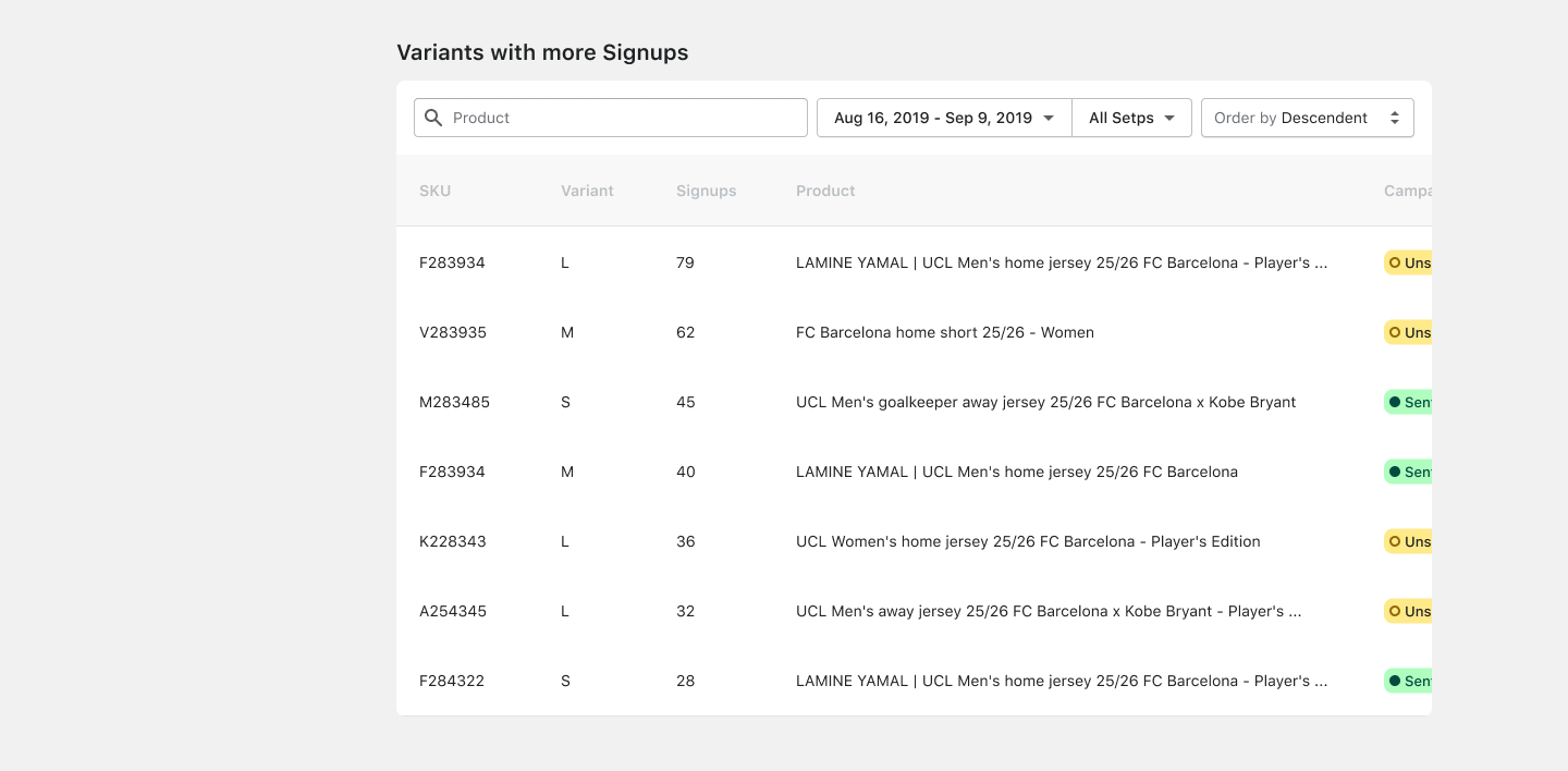
Variants with more Signups
The last piece of information they needed to see on the dashboard page for quick analysis was the specific variants receiving the most customer registrations, along with the status of those registrations (whether the notification had been sent or not).
They also needed to see the date of the last activity related to each variant.
As in the most wanted products case, having into account all the necessary data to show, it was more appropriate to show it through a table.
Products Management
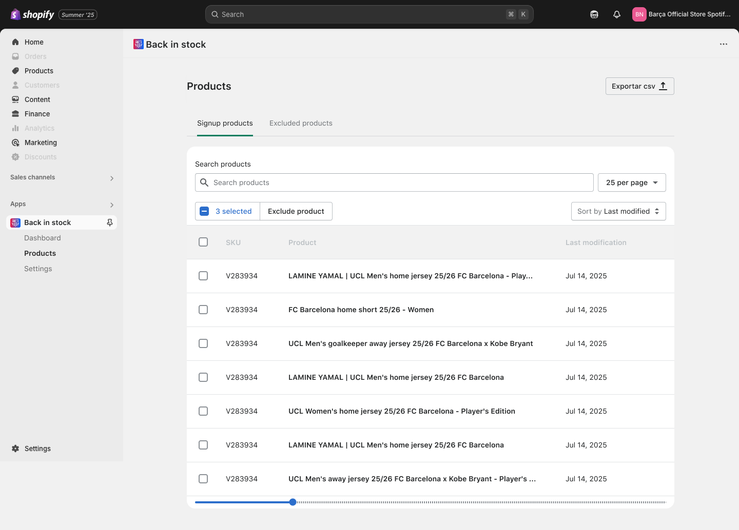
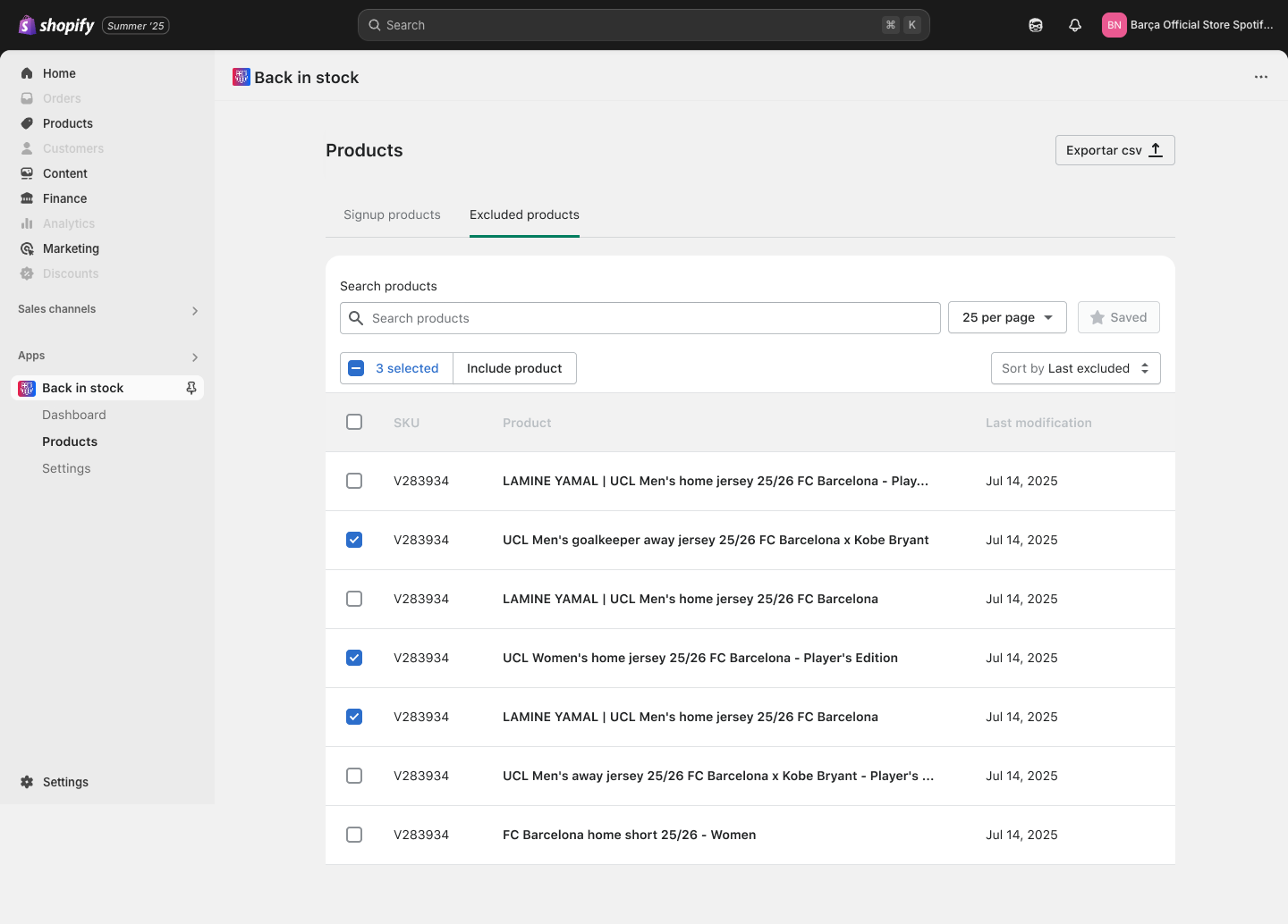
One of the main functions they needed to address with the app was the management of products that allow back-to-stock signups and those that do not allow customer registrations, either because they will not be restocked or because they have already received many customer registrations.
In this case, they needed a product list that would allow them to intuitively find a specific product and include or exclude it from the product list.
To achieve this, several alternatives were likely considered and discarded. The following are some examples with it’s reasoning why these options were not chosen:
- Single List with Toggle Switch
A single product list with a toggle to enable/disable signups.
Why Discarded: Unwieldy for large catalogs, lacks clear category separation, and toggling is error-prone for bulk actions.
– - Manual Entry System
Users manually enter product IDs/names into signup-allowed or signup-excluded lists.
Why Discarded: Time-consuming, error-prone, and inefficient for large catalogs; lacks visual feedback.
– - Drag-and-Drop Interface
Move products between signup-allowed and signup-excluded columns via drag-and-drop.
Why Discarded: Cumbersome on mobile, performance issues with large lists, and less intuitive for some users.
– - Filter-Based Interface
A single list with filters to view signup-allowed or signup-excluded products.
Why Discarded: Complex workflow, high cognitive load from filter management, and less direct for bulk actions.
–
Final Solution:
We created a dual-list submenu with two product lists: the products that do allow signups, from which you can select the products you want to exclude and move them to the list of products that do not allow signups. And the list of excluded products, from which you can select those products you want to move to the list of products that do allow signups.
It is intuitive, scalable, and device-friendly, offering clear separation, easy product selection, and immediate feedback, addressing the shortcomings of the discarded options.
Products addmiting signups
Products not addmiting signups
General app Settings
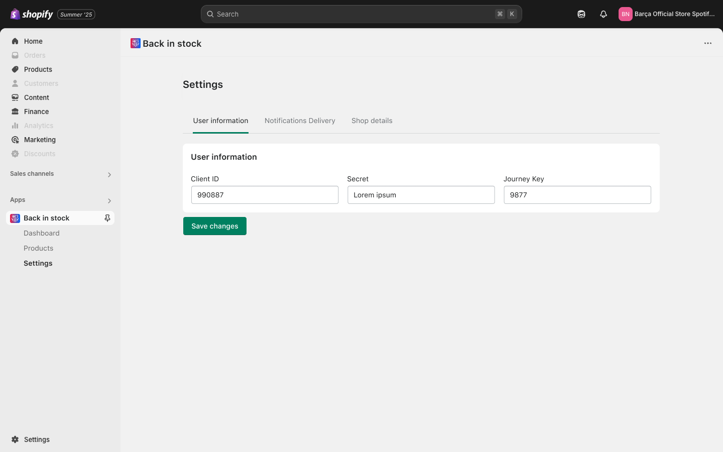
User information
Lastly, the only thing left was the app’s general configuration settings.
There were also some specific functions to address in this section.
On the first hand, they needed to have certain user information readily accessible and easy to edit.
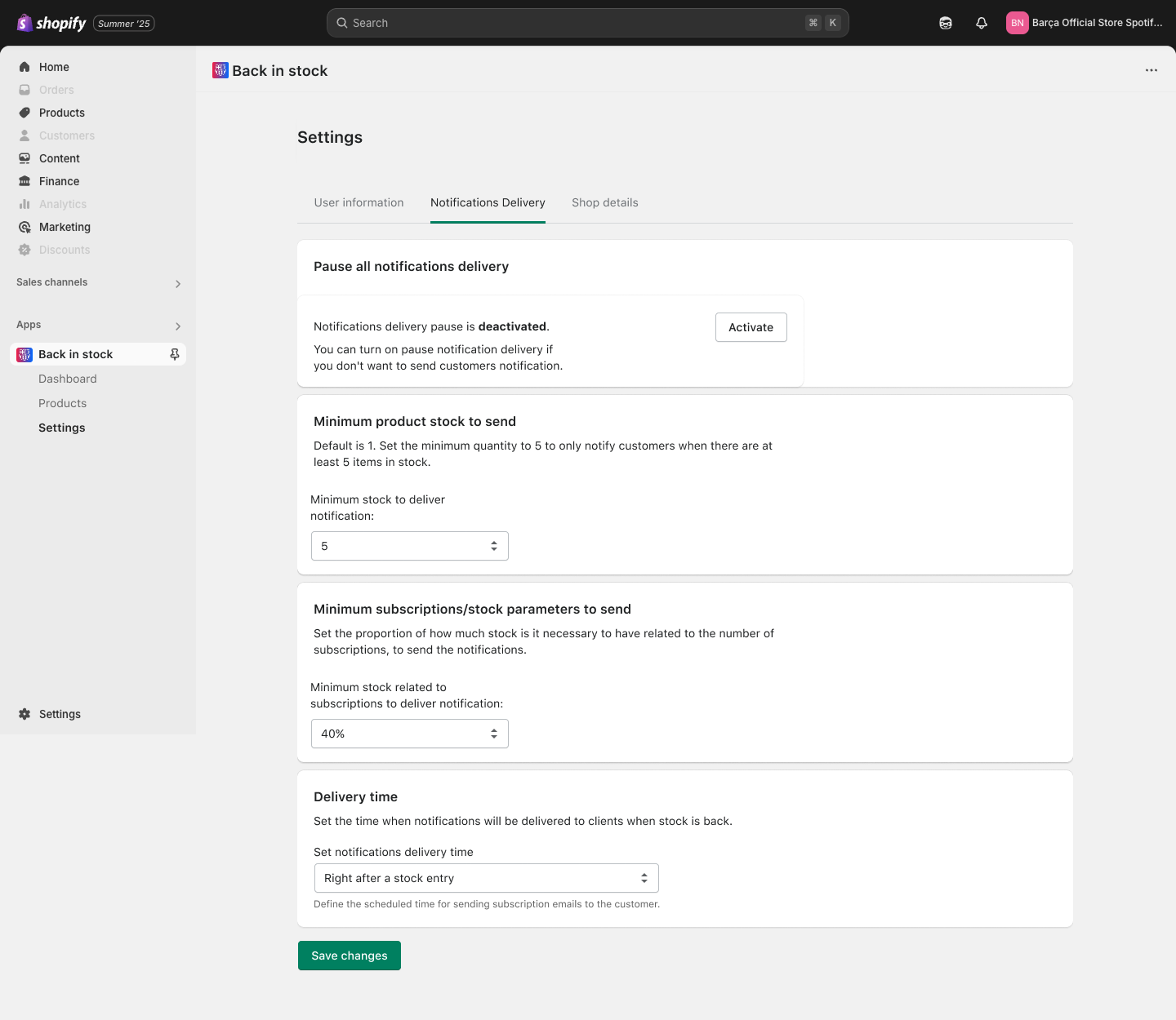
Notifications Delivery
On the other hand, a section for configuring notification settings was also needed.
From here, the client should be able to:
-
Pause all notifications.
-
Define the minimum stock level of a variant required for notifications to be sent.
-
When there are many signups for a variant, it was necessary to set a ratio parameter between stock and the number of signups, to avoid sending notifications, for example, when there are 200 signups and only 5 products in stock.
-
Define when the notifications would be sent.
By default, this would be immediately after the product comes back in stock, but they could choose a specific time of the day instead.
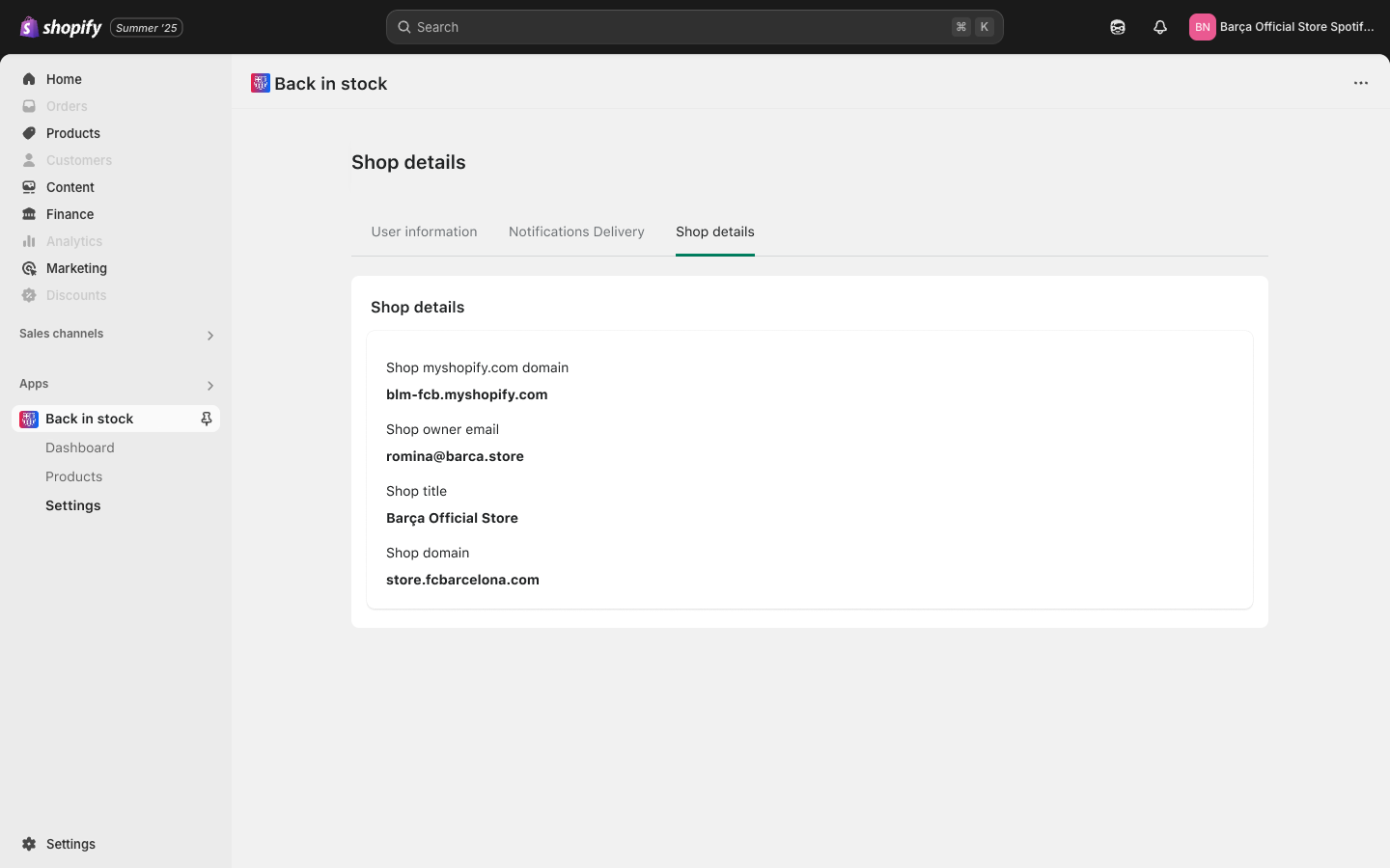
Shop Details
Finally, a section with the general information of the Shopify FC Barcelona store.
Key Takeaways
This project was jam-packed with a lot of work, exploration and discussion with stakeholders.
It would be impossible to summarize all the lessons learned from this project, but if I had to mention the main ones, they would be these:
Perks of being new to the field
Doing this project was super fun and so stressful too, since I navigated a domain that I knew nothing about. I brought unbiased opinion to the table since I wasn’t deep rooted in back-in-stock issues and developer limits that could tunnel my thinking.
Developers are your friends
I also tackled understanding this complex domain by learning the fundamentals quickly and managing complexity by leaning on my engineers. Asking questions daily and being in constant uncertainty was my state throughout the whole project.
Keep it simple and alive
Often, when making proposals to clients, we try to anticipate their needs. This often results in more complex solutions, or even losing focus on the main objective.
When, in fact, the most valuable approach is to keep it simple and let it evolve.

