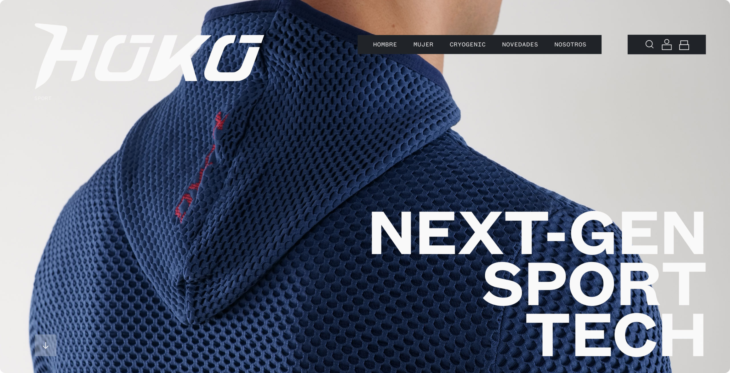
Transforming Hoko into a sports benchmark.

Hoko
Role Year
Brand and
product Designer 2025
Go to the website
Resume
Website redesign and brand image renewal, driving a complete transformation: from a functional brand to a technical reference in sportswear. With striking design, optimized UX, and a robust platform.
Achieving a stronger connection with its audience and improving sales, reputation, and positioning.
Client and Context
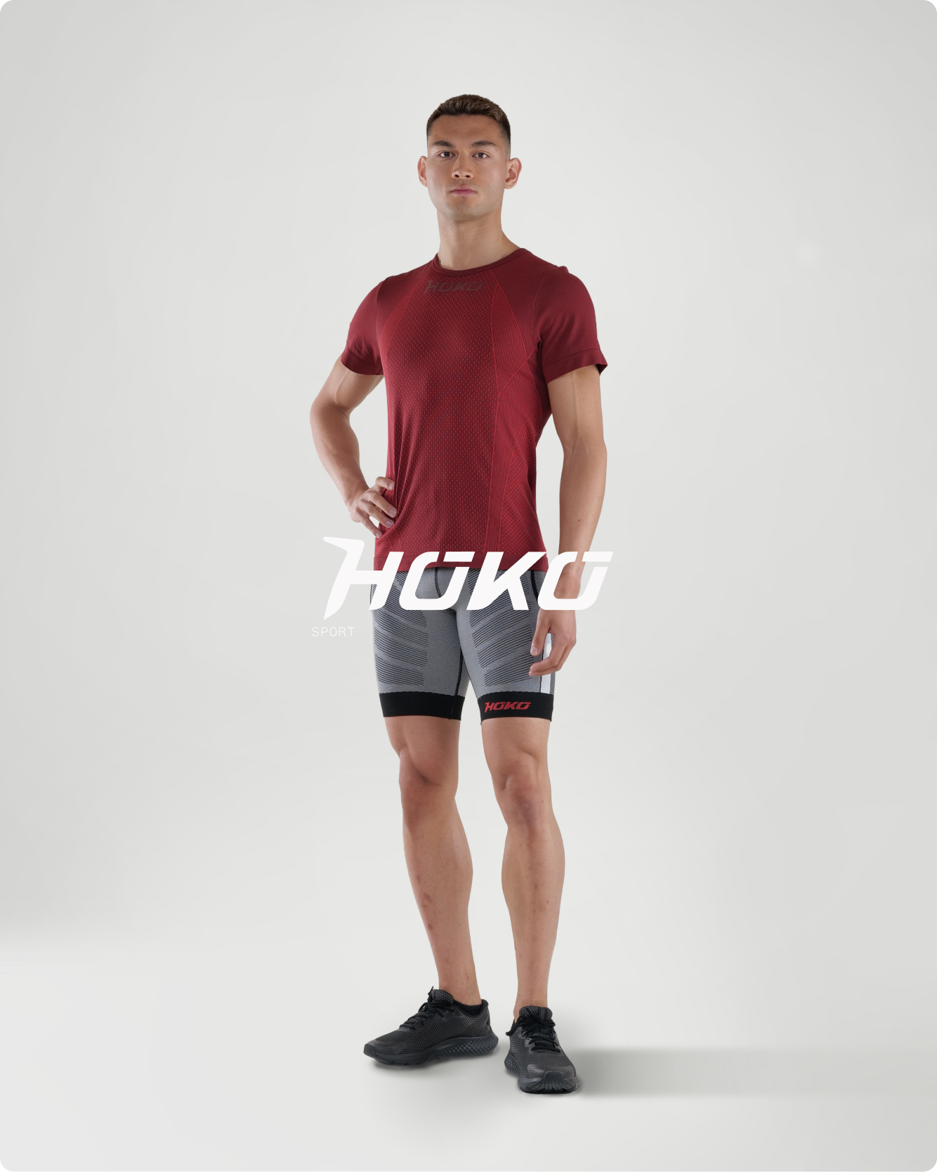
Hoko is a technical sportswear brand known for its innovation, advanced technology, and local production.
Despite the quality of its products, its brand image had fallen behind, no longer reflecting its values or technical essence. Its website presented serious usability issues on both desktop and mobile, affecting the user experience and conversion rates.
In addition, the online store failed to highlight the unique value of its garments or connect with its audience. Hoko needed a digital transformation that would align design, user experience, and brand positioning.
Challenge: Reposition the brand and boost conversion
Visual and communication rebranding
Create a new, modern brand image aligned with the values of technical innovation and athletic performance, clearly differentiating it from the competition.
Improvement of user experience and increase in conversion
Design an intuitive and functional website for both desktop and mobile versions, optimizing navigation and product presentation.
And increase online sales through a platform that highlights the technical features of the garments and streamlines the purchasing process.
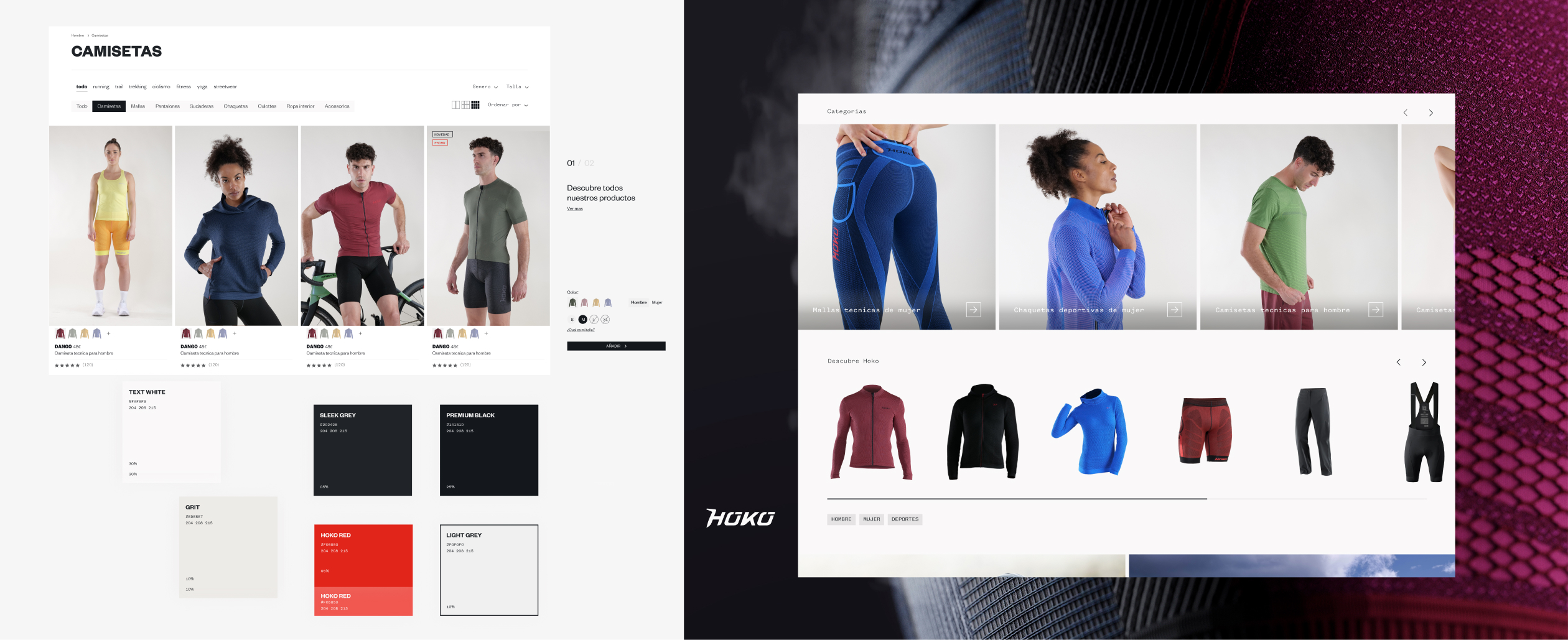
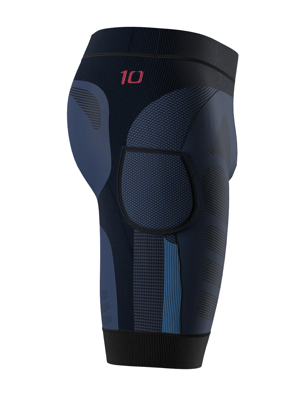
Building a new identity
The process began with a deep immersion into Hoko’s essence and its place in the market. We discovered a major paradox: behind technically advanced garments —with breathable fabrics, flat seams, bacteriostatic properties, and differential compression— there was an image that did not do justice to their level of innovation.
Its visual identity, based on generic colors, characterless typography, and an undefined tone, failed to convey the brand’s true value or differentiate it in a saturated market.
Our challenge was to shape a new visual identity that communicated technology, sophistication, and performance at first glance.
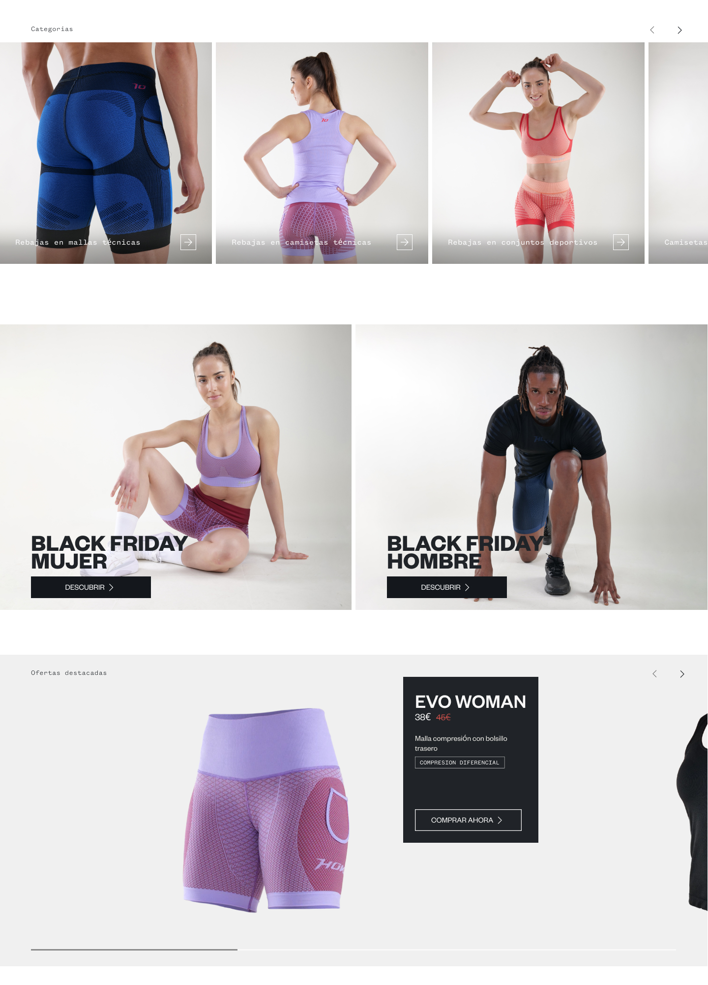
Website development in Shopify
With the new identity defined, it was time to bring it into the digital world. The challenge: to build a website that not only looked good, but matched the technical level of the garments.
We created a visually powerful experience, with striking design, high-quality images, interactive 3D elements, and videos that convey movement, texture, and functionality. Every detail was crafted to excite… and convert.
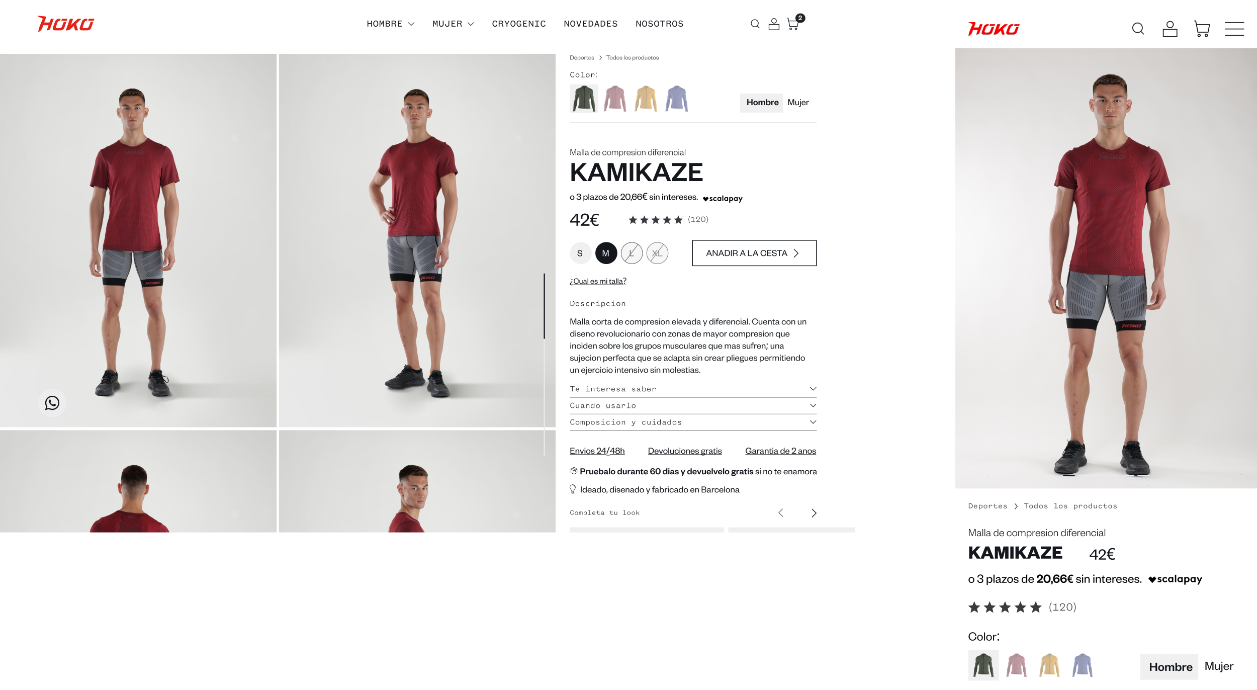
The product page became the core of the experience: modular sections highlighting key technologies, advanced materials, and real benefits, combining informative clarity with a carefully balanced aesthetic.
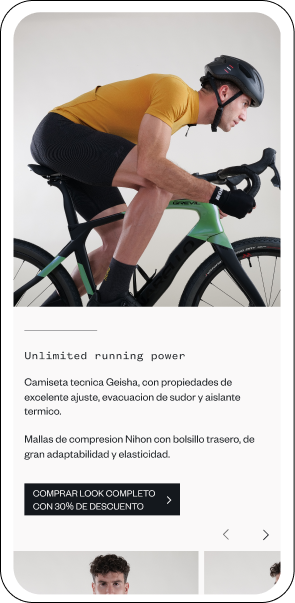
Mobile first
From the start, the approach was mobile-first, a strategic decision based on data: most of Hoko’s traffic comes from mobile devices. It wasn’t just about adapting the design to a smaller screen, but about rethinking the entire experience from a mobile perspective, prioritizing speed, clarity, and tactile interaction.
Every section was designed to be modular and flexible, allowing the Hoko team to easily update their collections and seasonal promotions without relying on technical support. The menu was built with an intuitive information architecture, optimized for one-handed use and designed to reduce the number of clicks needed to reach conversion.
Additionally, adaptive images and advanced compression techniques were implemented, ensuring fast load times without compromising visual quality —a key aspect for such a technical product.
CONVERSION RATE
+ 23%
ONLINE ORDERS
+ 20%

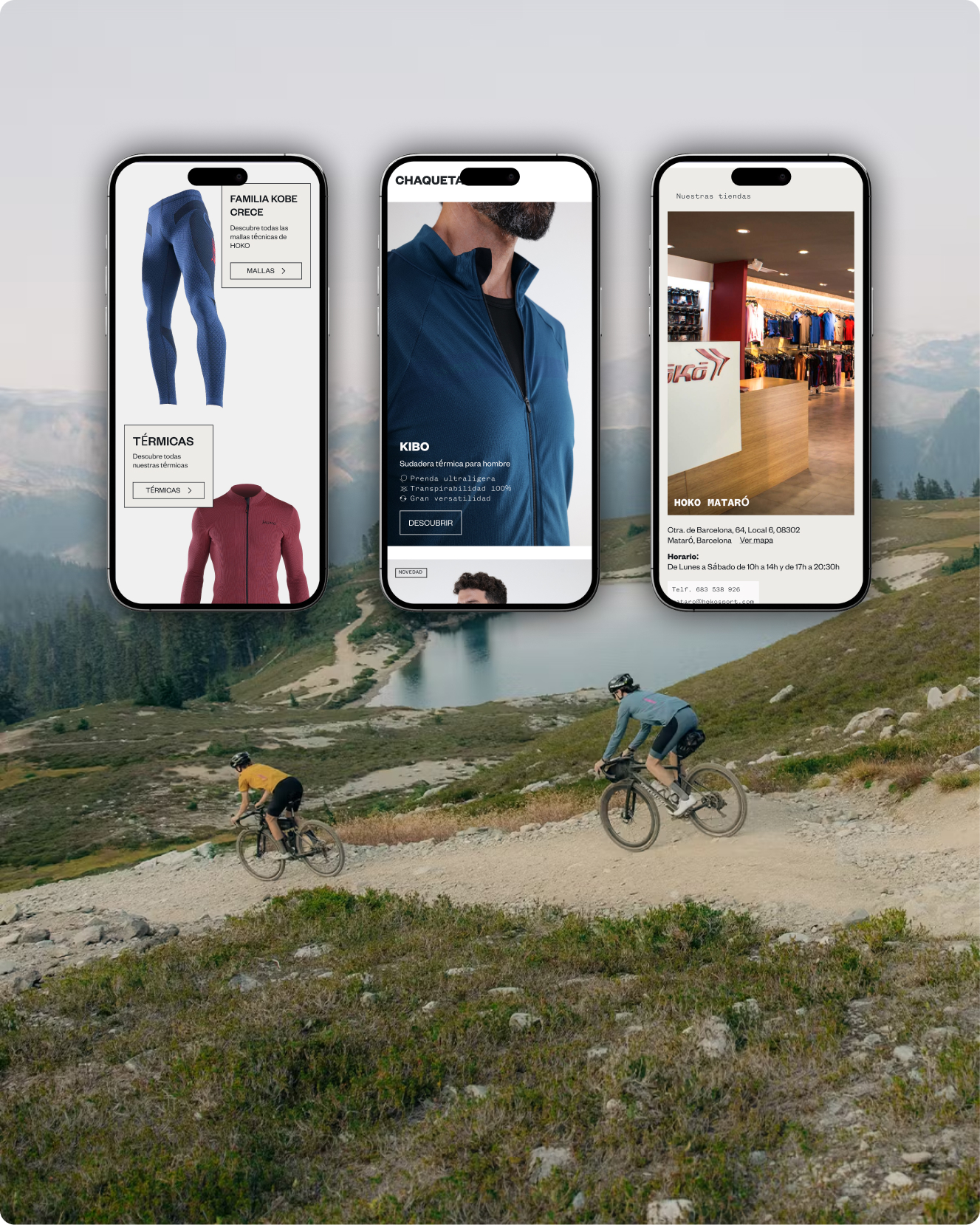
A strategic turning point
A transformation that consolidates Hoko as a benchmark and lays the foundation for its future growth
The comprehensive renewal of Hoko’s website and identity has marked a turning point in its evolution as a brand. Beyond a visual update, the project has meant a strategic redefinition of how Hoko communicates its value proposition and connects with its audience. The new design—focused on user experience, technical performance, and management flexibility—has strengthened its positioning as a reference in high-performance sportswear.
This project does not represent an ending, but the beginning of a new stage: a solid foundation on which to continue building. With a scalable platform, a coherent identity, and a digital experience aligned with its values, Hoko is ready to continue growing, innovating, and leading in its sector.

